In this week we have to create a design for a character using preferably the proper proportions. We have been given a template to use when designing our creations. However, I went with a slightly different route where i decided to use a piece of art i had already drawn on paper and give it better proportions.
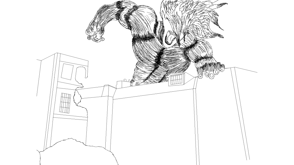
Even though i ran out of time creating this asset i feel like it properly represents to feel of the character i have drawn. Being Eren yeager from AOT.
I have created this from using a reference photo that came from the season 4 of the series.
I wanted to convey the energy by just the way the arm looks, as if it is a spring about to be released and create havoc. and also created energy with how the hair looks.
A quick note is that even though I couldn’t properly get the line weight to work I think the places where your supposed to see it haven’t changed for the worse, significantly. I did try something stylistic where at each section it is sort of split by the amount of lines there which some what conveys depth and creates a less flat image even though it is just two colours.
I ideally would’ve liked to spend more time on the environment, however it is at the point where it definitively shows the buildings, just without any colour or texture applied. another ‘Bad’ thing is that the torso is shaped weirdly, and this is mostly due to the shading technique I used and put it somewhat in the wrong places.
A few good things I like about the piece is the general shape of the ‘Titan’ and also the proportions of the ‘Titan’ from the head to the hand seems to look correct. The hair looks really nice when compared to my pencil drawing of the same character.
Reference
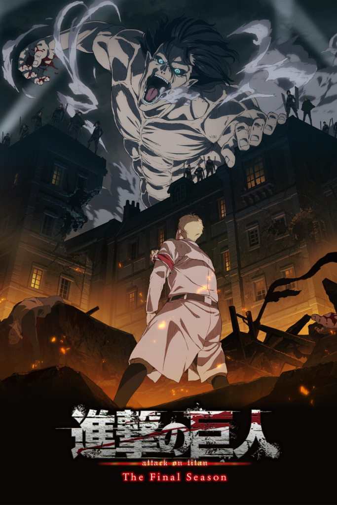
The composition and look of the art made me immediately fall in love with this cover art for season 4. It shows us the “good guys” finally winning however with how it is shot it makes them look like the villain in their own story. The way ‘The Attack Titan’ just stands towering over everyone, whilst Reiner the supposed bad guy is just standing there at the bottom beneath everyone defeated. The way it makes our eyes look whilst looking, where start at the top going down making us look at the ‘good guys’ and then we travel further down into the dead bodies. It is an amazing piece of art that fits well with the theme of the season.
MAPPA. (2020) AOT season 4 The Final Season[Cover Art]. Available online: https://www.pinterest.com/pin/660129257871592853/ [Accessed 15/11/2022].